Brand Identity for Isobar Compression
Advanced Therapeutic Materials spent a decade developing Isobar – the ultimate compression garment – medically and technologically superior but with a brand and identity that didn't reflect their unique offer.
Isobar's previous identity
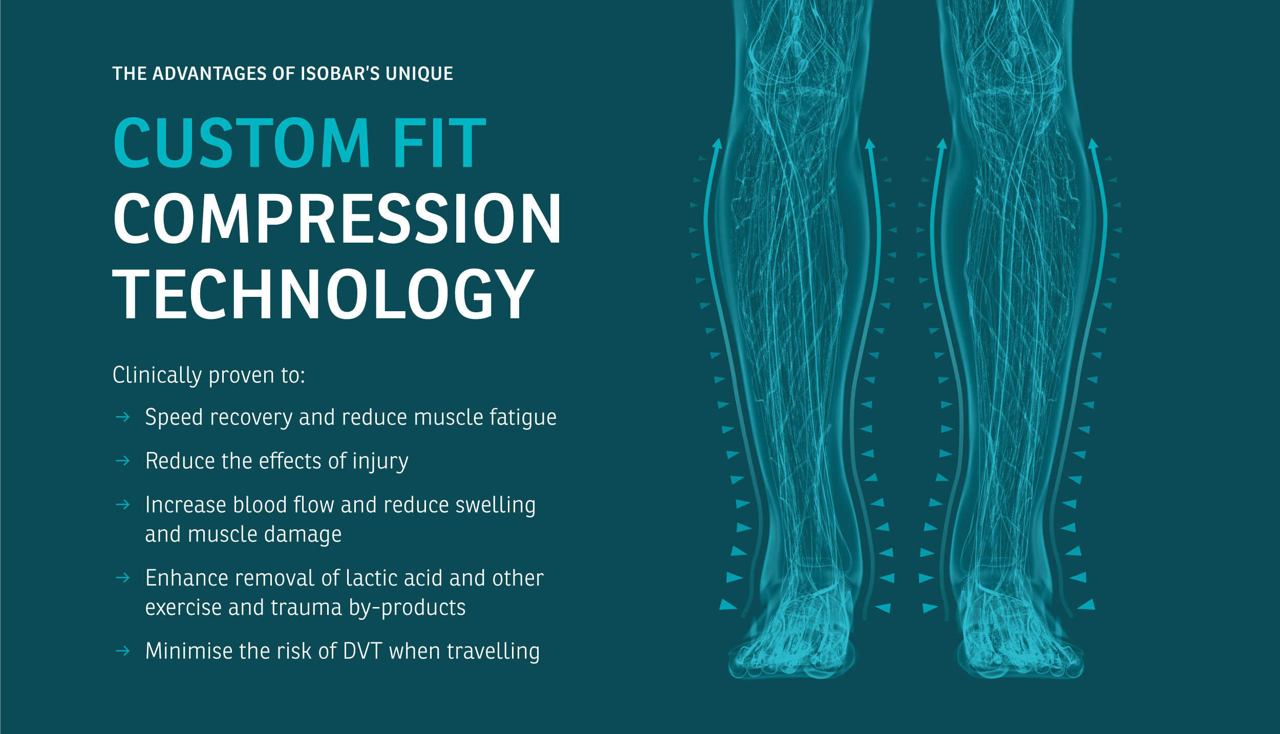
The new brand identity was designed around the insight that Isobar helps pump blood back up to the heart more effectively than any other compression garment, with the A becoming an upward pointing arrow.
Inspired by Isobar's heritage in material science and clinical research the brand was designed to look, feel and sound like you’re having a consultation with a clinical expert able to explain compression in simple, everyday language.
The brand patterns derive from Isobar's 3D scanning technique that enable them to create compression garments to the exact topography of people’s limbs.
The 1.5mm grid pattern used on printed items visually illustrates the millimetre precision and accuracy of Isobar's scanning and stitching process.
Creative direction: Ian Whalley
Design: Ian Whalley & Jay Tunbridge
Brand strategy: David Hensley & Sam McCollum at Hensley Partners


